Project type: Brand identity, copywriting, marketing
Brief: Dyson Creative Challenge 2025: Stem
Date: 03/2025
Stasis is the outcome of the 2-week design challenge set by Dyson during my final term at Arts University Bournemouth. The brief was to design a brand identity, copy matrix and marketing strategy for a device that stops critical bleeding from gunshot and stab wounds.


A two-week, intensive design challenge
Every year, Arts University Bournemouth's Graphic Design course enters a design challenge run by the creative team at Dyson. In 2025, the challenge was to design an identity and strategy for a device made by ACT Medical, which is designed to stem critical bleeding from gunshot and stab wounds.
The brand identity
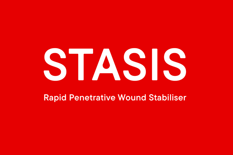
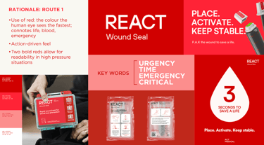
The brand identity for STASIS is centred around time and criticality. I chose shades of red for the colour palette of the product as it not only connotes emergency and urgency but is the colour the human eye sees the fastest—acting fast is vital in emergencies involving stabbing and shooting-related injuries.
I chose a motif of droplets for the extended brand language, ensuring a strong and recognisable visual thread throughout the identity, shown below on the showcase stand, posters and instructional materials.
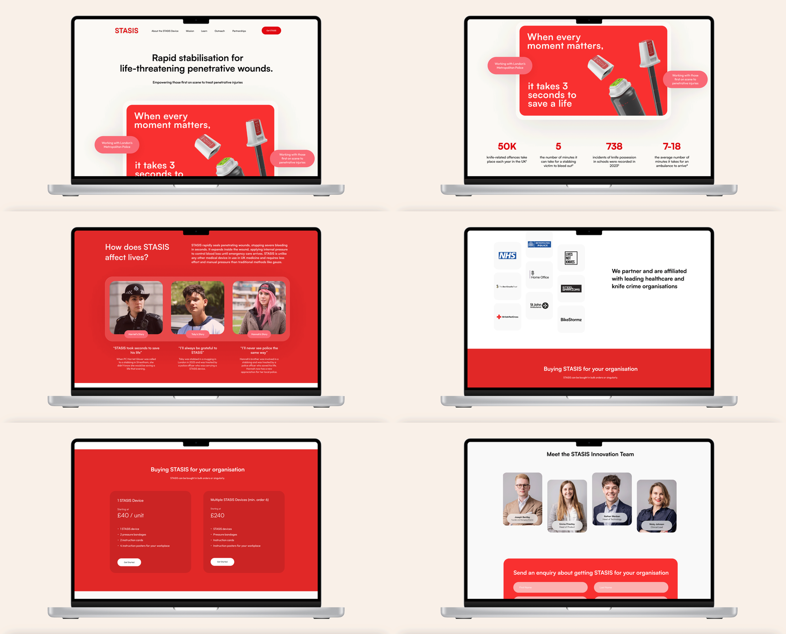

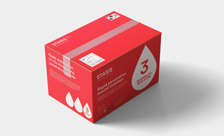
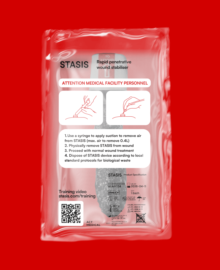
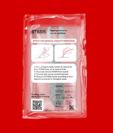
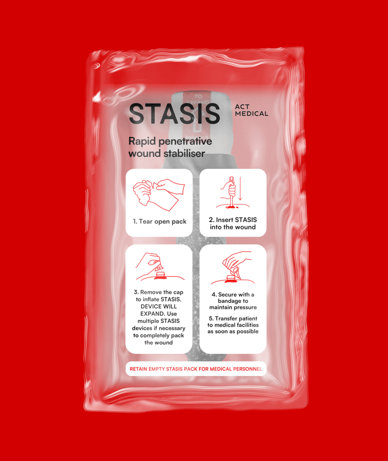
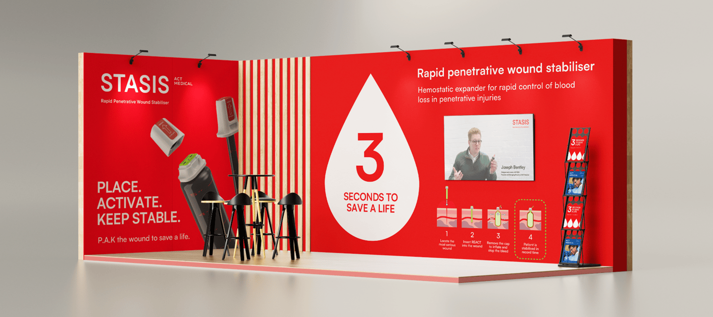
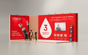
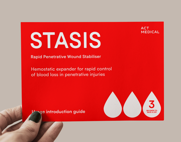
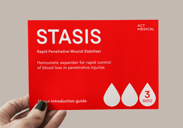
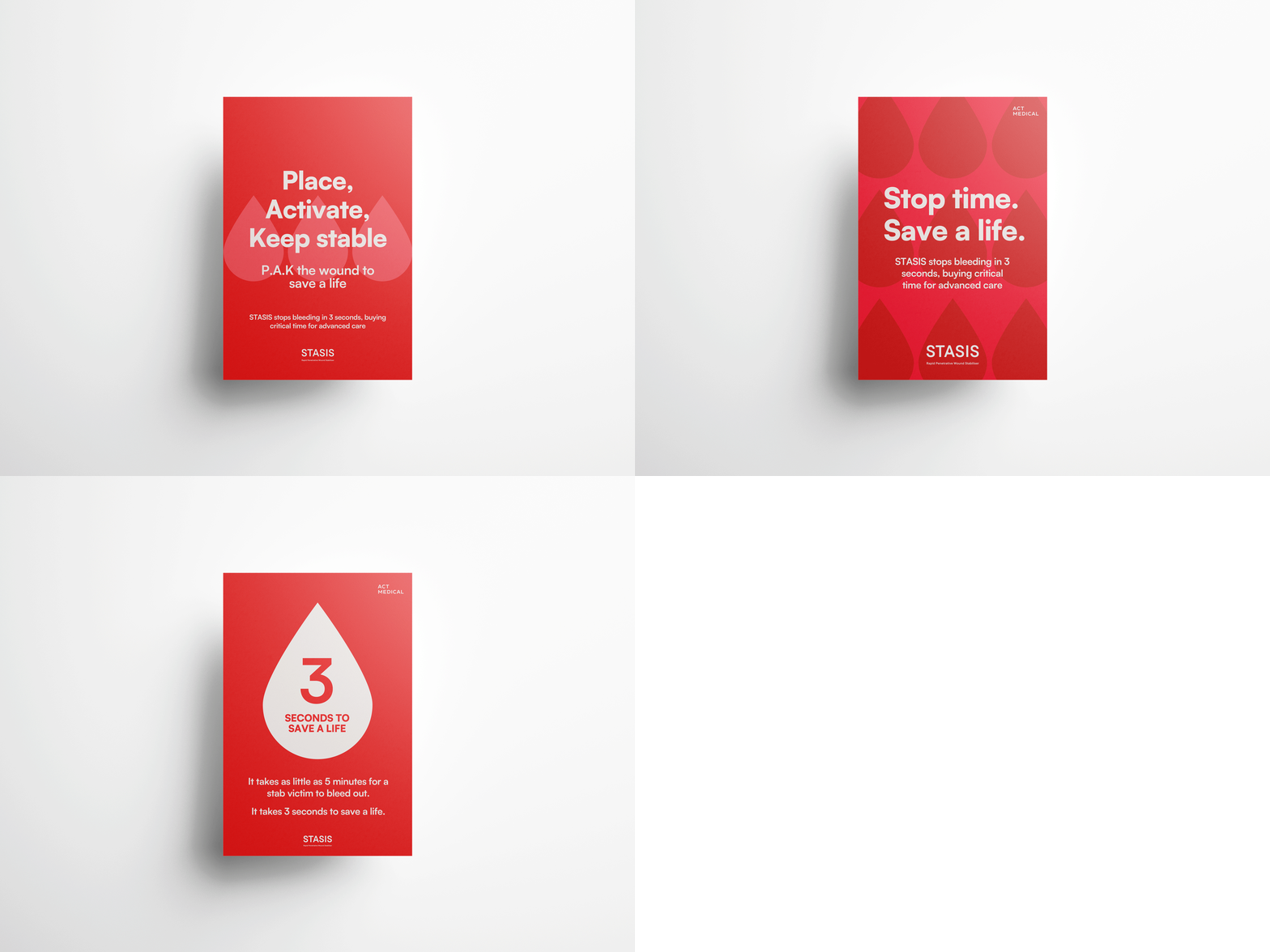

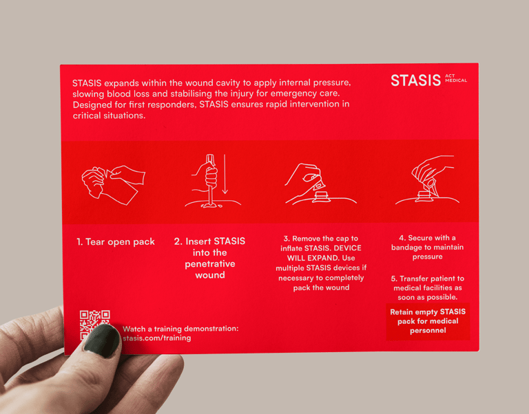
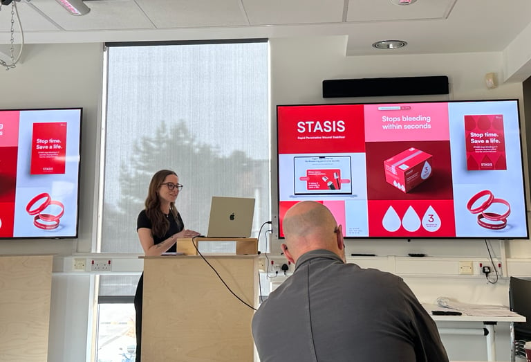
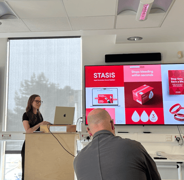
I presented my final proposal to Chris, Ali and Harriet from the Dyson creative team, Nathan from ACT Medical and to my coursemates and lecturers and was then selected as the winner of the project for my university.
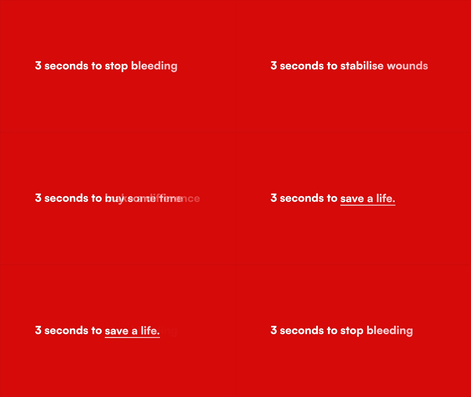
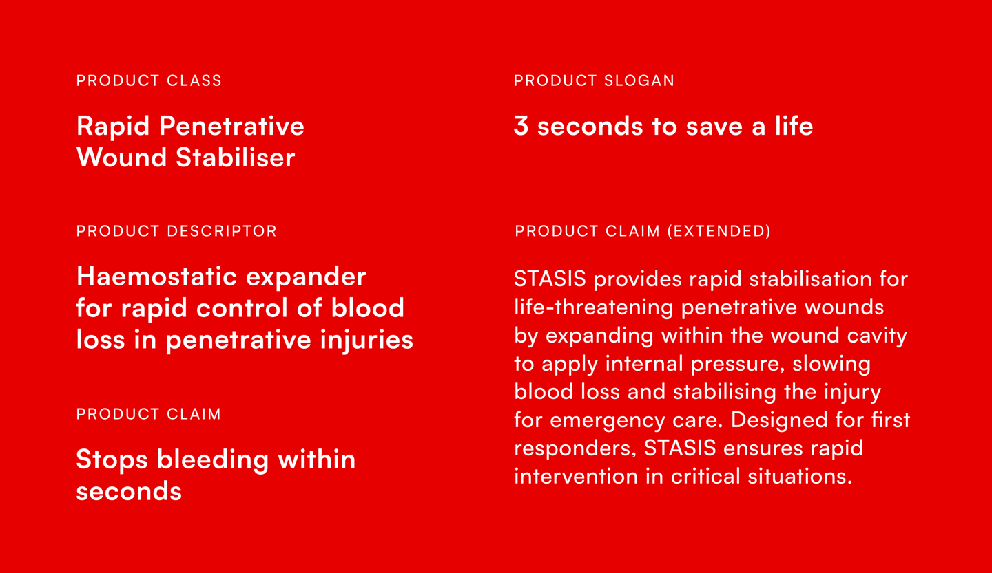
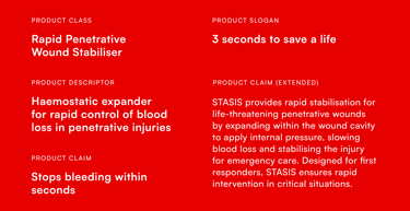
Copy & naming hierarchy
Dyson has a naming hierarchy system that allows their product advertising to convey different levels of information depending on the context. For this project, I needed to create a copy matrix to define the product's class and descriptor, as well as its claim and any supporting copy. This element of my outcome was noted by Dyson as one of the strongest parts of my proposal.

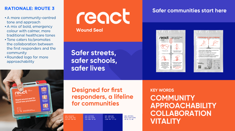

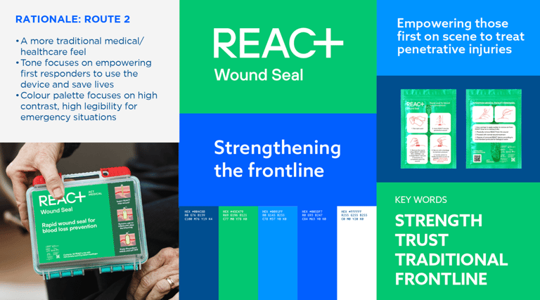
Designing a parent company
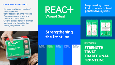
This brief also required a brand identity for the parent company of the device, ACT Medical. I went down the traditional medical/innovative visual route, using calming and trustworthy shades of blue with an assertive and modern wordmark and typeface.


